You are invited to present your work to your stakeholders next week. You have suggested topics from your boss and coworkers. You know your stakeholders well and know your topic well. Your timeslot with the executive team is 20 minutes. How do you make a compelling presentation that is easy to understand?
Mastering the art of executive presentations takes practice. Let's talk about the Dos and Don'ts of slides for a compelling executive presentation.
Use visuals more than text
Let your graphs and pictures help communicate your points:
DO use graphics instead of a list of figures
DON’T use boring text


In the DO example, the mix of product sales is shown in the pie chart. In the DON’T example, the audience has to read to the bottom to see that one product was 40% of the sales.
One Message per Slide
Communicate a one-sentence message on each slide. The audience needs to easily grasp your message.
DO stay on point with the title of the slide
DON’T expand into unrelated topics on a slide


The subpoints of the Product Overview relate to the product differentiators in the DO example. The subpoints of the Product Overview are unrelated to each other in the DON’T example.
Use Color Themes to Tie Points Together
Repeat the same color theme and logos to represent the same things in slides. Keep alignment to make it easy to see comparisons.




In the DO example, the color is the same for each product in the Sales and the Forecast. In the DON’T example, the color isn’t the same for each product in the Sales and the Forecast.
Logical Progression That Builds to a Conclusion
Using slide sorter view check that your storyline builds from slide to slide. Focus on a single area for the presentation and avoid going on tangents to discuss multiple problems.
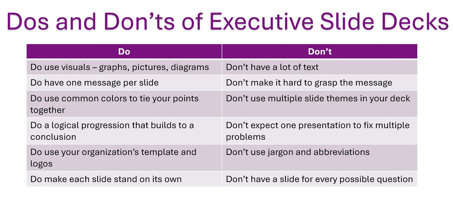
Summary Dos and Don’ts for Executive Presentations
Creating and presenting compelling executive presentations is an important skill for product leaders. Holding the attention of busy executives through an effective presentation is crucial to getting your ideas approved. When it is time to finalize your slides, keeping these Dos and Don'ts in mind will put your work in the best light with your executive stakeholders:
Use more visuals than text
One key message per slide
Use colors and logos to tie your slides together
Arrange a logical progression of slides that build to a simple request
Mastering the art of presenting concise, informative, and engaging presentations takes practice. Over time you become more effective at conveying your message to executive stakeholders!
More suggestions on presenting to executives:
Are there any other Dos and Don’ts of executive presentations? Please leave comments on your own Dos and Don’ts!




Really good suggestions, Amy! I’m saving this in my bookmarks as I know I’ll come back to your advice later.
Great post Amy. I have seen some real doozie's of a Powerpoint presentation recently. Will be forwarding on this less to the creators for sure.